
As I near the completion of my book No Excuses Fitness, I’ve been experimenting with the layout of Kindle book covers.
After some trial and error, and critique and feedback from some folks, I chose this as the final candidate.
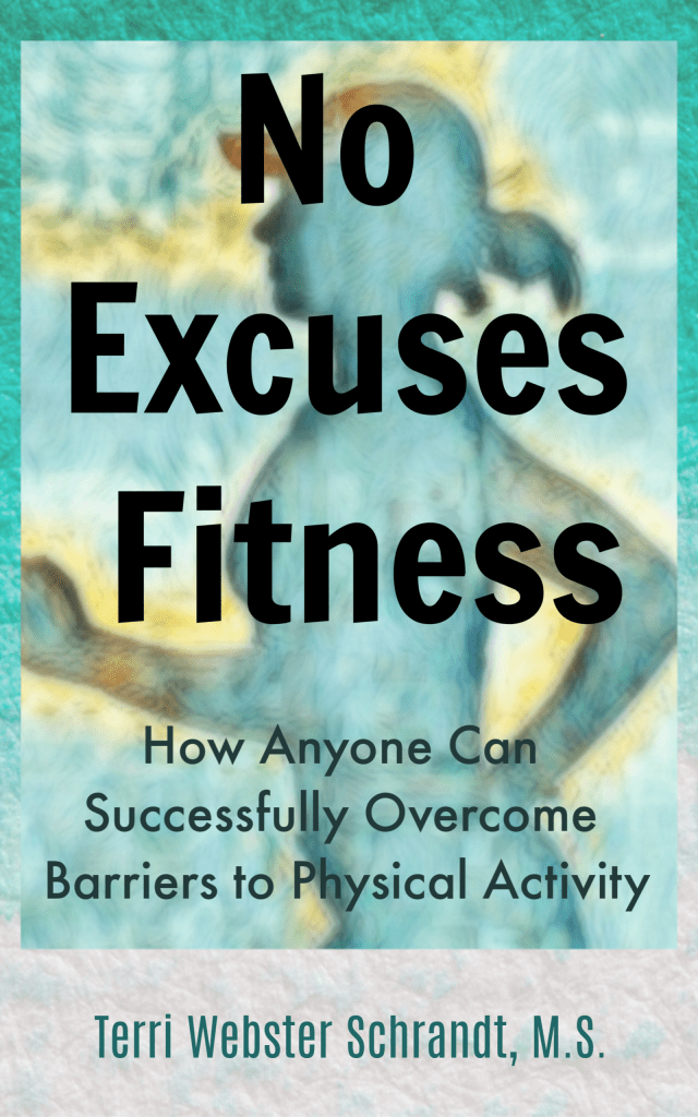
What do you think?
How did I do it, you ask? Here are the tools I used: Unsplash, Dropbox, PicMonkey, Canva, and Painnt. Let me take you step-by-step.
It was surprisingly easy, using an image from Unsplash, an overlay from Canva (free version), the mobile Painnt app and my premium PicMonkey account, saving everything to my Dropbox account.

I initially used Canva to research templates for Kindle book covers. Although the free version of Canva has Kindle cover templates, I found it very limiting, unless I bought the premium package. However, I did find a textured overlay that I exported.
Although I have a lot of my own fitness images, I decided to search in Unsplash, a free image collection website. I found a silhouette of a woman running which works for this cover and for what I want to convey. Unsplash allows users to use, edit and publish images without copyright infringement.

A small caveat: using images of faces from free or reduced-fee image collection sites is risky, in my opinion. They are probably OK to use for blogs, and I use these images for my PowerPoint slides, but I would steer clear of using faces in a published book or other works. How do you know the person authorized their image to be used? Lawsuits happen over copyright infringement, so keep yourself protected.

Once I cropped the image, I used Painnt, (a mobile app that lets you upload images to your choice of filters), to alter the image further. I chose a filter that had similar colors to the above overlay.
In PicMonkey, I used their book cover template and simply used the Canva overlay as the base. I then uploaded the image (as an overlay) and experimented with text and colors with the result you now see in the first image.
If you are a serious photographer and want to easily edit your images and create graphics for blogging and other projects, but don’t want to spend a lot of dollars, I highly recommend the premium package of PicMonkey.
Picmonkey costs $47.88 per year ($3.99/month) which now gives me free access to mobile editing straight from my phone.
I like Painnt for the filter effects. Painnt is a Microsoft product for mobile that costs $12.00 per year and eliminates the watermark.
If you are a Canva user and have a premium account, you should be able to create Kindle covers very easily.
I save all my work in Dropbox. I also pay for a premium Dropbox account which costs $120 a year ($10 a month) giving me 2TB of storage.
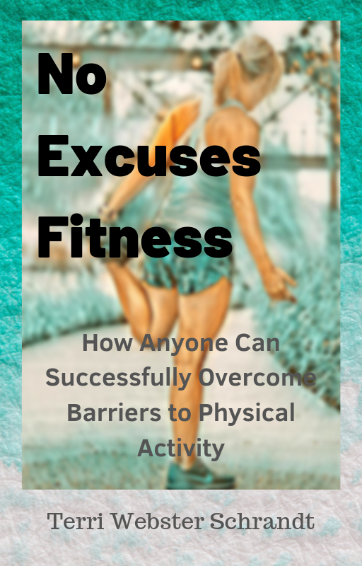
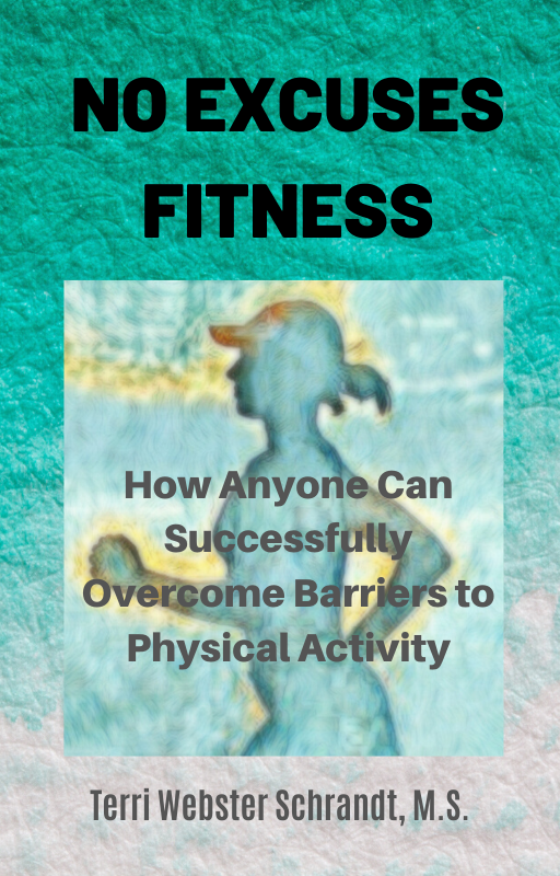
Below are the three covers that were voted down. They were all created using the tools as described above.
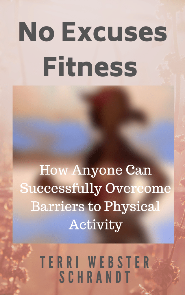
As a photographer, I enjoy using Adobe LightRoom but I save that for the serious images rather than graphic design projects. Topaz Labs, a photo editor with cool filters, is an add-on to LightRoom. Both of these are on the pricey side. I chose Painnt over Topaz Labs since I don’t use it every day. LightRoom already comes with my educator subscription to Adobe Creative Cloud.
To create my final book cover, my cost was about $15, not counting the time I put in to do the work.
While on my creative cover streak, I also created a custom logo and watermark for the book and social media. What do you think?

This was created in PicMonkey, too, using text and overlay features. I was able to change colors from the original overlay. Her hair color now matches mine and I like green.
If you delve into the world of creating book covers or other graphic design projects and have a little creativity and patience, then I hope you can find the right set of tools for use. These worked for me.
Eventually I will have to design a paperback cover, too. I believe Kindle KDP has a “how-to” for that. I will keep you posted. And I will welcome any ideas and suggestions.
My launch date for No Excuses Fitness is set for early June 2020. #NoEXFit
Creating an attractive book cover is both an art and a science. Hiring a professional to create your book cover is money well-spent, but if you have skills in photography and graphic design, you can successfully create your own using the tools as I have explained.
And it was fun and a nice break from writing.
…And I need to get back to it!
Who knows? Once I finish this book project, I might delve into book cover design!

© 2019 Copyright-All rights reserved-secondwindleisure.com
Discover more from Second Wind Leisure Perspectives
Subscribe to get the latest posts sent to your email.


I enjoyed looking through this post and reading about your process.
LikeLiked by 2 people
Thank you!
LikeLiked by 1 person
Hi again – I am not sure if this is too late – but the covers all seem like this is for women only.
LikeLiked by 1 person
Not too late. I thought about this, and I hope to get male readers so I may need to go for a more neutral cover. Thanks for the feedback.
LikeLiked by 1 person
Also the lady’s body is too big in scale – IMHO – Further (if you don’t mind my being honest) I think you also limit the women readers with that image too. It seems to appeal to a a very fit younger woman – perhaps I am wrong but because we come in so many shapes and sizes – the girl (or woman) but she seems young – well she is a certain body type – already Uber fit and -well…
In the yoga world we grow so weary of the stereotypical yogi used in ads and on covers—// you know the type – the extra lean figure (looking underfed) with low to no body fat and wearing half shirts doing super limbo poses – when in reality most who practice yoga look nothing like the women used for ads.
And so when I saw that cover -first I thought it might be the story of some lady’s bio – then – my next impression – I just thought it was a book for young athletes – likely female – and maybe the book would be about how to fine tune the workouts – for already fit people –/
When I continued to read I saw that the book is really for everyone – or wait – the ones not with a routine!! and your goal is to help people get motivated – get moving and find ways to start… and keep it going – right?
And oh my goodness do we need more of this content in circulation .
—
The pros of the cover – the color – that teal with value had interest and was easy on the eye and connected to fitness
Also – The minimal vibe- although the scale was off and the girl’s outline seemed too large – I could tell you were going for less is more cover.
—
Okay / one last comment –
I was shocked at the irony of you not using your own image after you wrote a book about blogging with your own photos. Still makes me chuckle –
But I know that sometimes it is more than okay to grab some free stock images! They have rescued me many times and there are some great images out there.
—
In closing (can you tell I like to talk about book covers – ha)
I think you should create a cover that has a few tumbling squares (or circles) with joyful photos inside –
Keep the teal – but show a few photos that depict the beauty that comes with getting motivated and improving life. It is a big deal…
And in this day and age where doctors are not encouraging exercise like trey should – and instead they are coming up with weird conditions that keep people from thinking they can get working out…
Well we need a book like this – for men – women – trans – and especially those with autoimmune and depression
LikeLiked by 1 person
I agree with your points and I appreciate the comments and perspective! I do plan to put my image inside the kindle book and on the back cover of the paperback. Thank you, Yvette, for your critical thinking and approach to the cover. I have work to do! 😁
LikeLiked by 1 person
Well I was Passing time in the sauna (we have a red light sauna and I try to sit in there every day – it is pretty awesome) and so I had a Little time to expound – glad it was not too much – and of course you can ignore all of it — lol
Have a great week and be in tour again later
LikeLiked by 1 person
You gave me great food for thought, believe me it’s much appreciated.
LikeLiked by 1 person
My pleasure
LikeLiked by 1 person
Hi Terri, I love your new cover, and think you’ve definitely chosen the best and most “clickable” one. I also really like your font selection – especially the unmissable clarity of it. Toni x
LikeLiked by 4 people
Thanks millions for your professional advice and comment, Toni! It means a lot coming from you!
LikeLiked by 2 people
The book cover version you choose is definitely the most appealing cover. I like it! I agree with you that I wouldn’t use faces, or images of people that I do not personally have a written consent from. In the first book I published https://www.amazon.com/Nevada-Mustangs-Living-Symbols-West/dp/132006051X/ref=tmm_pap_swatch_0?_encoding=UTF8&qid=1571945876&sr=8-1 there is a large photo of a Native American lady performing a ritual inside of the book. I took the photo myself, and I got a verbal consent of using the image, but I never got a written consent and I remember that made me nervous for a long time. Best of luck with the rest of the process of publishing your book. ❤
LikeLiked by 2 people
Thank you, Maria! I think verbal consent is fine. I need this break to keep at it! Have a Merry Christmas!
LikeLiked by 2 people
Merry Christmas Terri ❤
LikeLiked by 2 people
Hi Terri!
I definitely prefer and like the version you picked over the other two. The imaginary and colors are great. I love what you did with the tools and options you had available and I’m sure you had fun playing around with it. I wonder whether there is a way to not cover up the entire book jacket/book cover with text, though. Or whether another color for your title would integrate with the background better, but would still stand out enough. Or a smaller font and keep the black letters? This is tricky.
Part of me looks forward to creating a cover for my memoir (in Canva) myself, but I do believe it is hard to not make it look like a self-published book. If only I could afford a professional for things like that. 🙂
LikeLiked by 3 people
Thank you for the valuable feedback, Liesbet. You make a great point about the text. This cover image will be for the e-book cover. I haven’t decided on how I will tackle the paperback cover since it involves the back, too. I may go with a similar cover to the one on the far right of the gallery, with smaller text and font colors. Decisions, decisions!
LikeLiked by 1 person
I love the cover and adore that you explained how you did it. I’ve made a lot of book covers in Canva but not for my ‘important’ books. This was a great tutorial.
LikeLiked by 2 people
Thanks a million, Jacqui. If people have either Canva or PicMonkey and are comfortable with either choice, easier to stick with what they know.
LikeLike
That is an eye catching cover! Thanks for explaining your process for creating it. Congratulations on finishing a book project. Nice logo, too.
LikeLiked by 2 people
Thank you, Eileen!
LikeLiked by 1 person
I love both, but especially the custom logo, Terri. It’s simple and really stands out.
I don’t think I would have the patience to create my own book cover, although I do enjoy creating my blog post templates, even though I get frustrated at them sometimes. Thanks for taking us through the steps.
Don’t forget to come over and promote the new book on my blog. The door is always open to you.
LikeLiked by 2 people
Thanks, Hugh! Creating a cover can be a little frustrating but I also looked at several covers to see styles I liked. When the time comes to promote my book, I will certainly take you up on that offer!
LikeLiked by 1 person
I like your final choice over the other options. It’s an interesting process to try things out, and see what works and what doesn’t. There’s often no right or wrong answer. It’s just what works for what you want to present.
LikeLiked by 2 people
I also got some good feedback from my daughters, all Millenials who are involved in fitness. Simpler is better, thanks Graham!
LikeLiked by 2 people
You are so creative Terri. I love to see the options you were considering and how you put it all together.
XOOX
Jodie
LikeLiked by 3 people
Thanks, Jodie! It was nice to take a little break from writing and editing and do something creative.
LikeLiked by 1 person
Good job Terri – I definitely prefer your choice over the other options. Good luck with the book!
LikeLiked by 1 person
Thank you, Tina, I appreciate your feedback!
LikeLiked by 1 person
Hi Terri,
I like the colors on the cover you picked. I also really appreciate you telling us how you did it. I am also working on a book. All I need to do is figure out how to publish it and your process will be helpful since I plan to do the cover myself too. I don’t have any experience with any of those things, but you make it sound like it should be doable.
I really like your new logo.
LikeLiked by 2 people
Hi Jill, thank you and how exciting you are working on a book, too. I recommend looking at other book covers and deciding which ideas resonate with you and go from there.
LikeLiked by 1 person
That looks great Terri and I also enjoyed your walk through the process, so thanks for sharing your thoughts. I use Canva quite a bit and LightRoom to edit. Well done and can’t wait to see the final product next year.
LikeLiked by 1 person
Thanks for your support, Debbie!
LikeLiked by 1 person
Great cover, thanks for sharing your process! I enjoy using PicMonkey also, although I use Luminar (sort of like Lightroom) for more intricate editing. I have been considering investing in Dropbox to backup my pictures and documents so I’m glad to know that you like it. When I was a Graphic Design major in college – way back when – we didn’t have computers. I love that the new technology is so accessible and relatively easy to use… and fun!
LikeLiked by 1 person
Thanks, Janis! I’m sure computers have revolutionized graphic design. I took a couple of art classes in college and remember what it took to create graphic art from scratch!
LikeLiked by 1 person
Love your choice. Thank you for sharing your creative process. So excited for your forthcoming book!
LikeLiked by 1 person
Thanks, Lisa, I got great feedback and gradually changed the details.
LikeLiked by 1 person
So much to love about the book cover. First and foremost, that it covers a book! Congratulations on your latest book. I am so very proud of you.
The cover art is lovely. The colors spoke to me first. The soft tones of the blue-green combination. Just beautiful. But I also like golden shade radiating from the runner’s body, or perhaps it is her healthy aura? Uplifting, welcoming, warm.
SO PROUD OF YOU!!
LikeLiked by 1 person
Thank you, dear Leslie! Still some writing to do, but this was a worthy distraction. Thank you for your feedback about the colors, aqua is a very universal color. I hadnt noticed the gold radiating from the runner, so thank you for mentioning that.
LikeLike
The cover looks great and I like it best of the four options. Your logo is also very attractive.
LikeLiked by 1 person
Thanks so much, Shari, I appreciate your feedback!
LikeLiked by 1 person
Awesome job! Thanks for sharing how you created it. I love playing around with Canva and if I were more serious, I’d probably go to the paid version.
LikeLiked by 1 person
Thanks, Ingrid! It makes sense to find one and use it with all its benefits.
LikeLiked by 1 person
Nice post. Your blogsite has a nice layout. Easy to read and navigate!
LikeLiked by 1 person
Thank you!
LikeLike